Website Accessibility Checklist for 2024
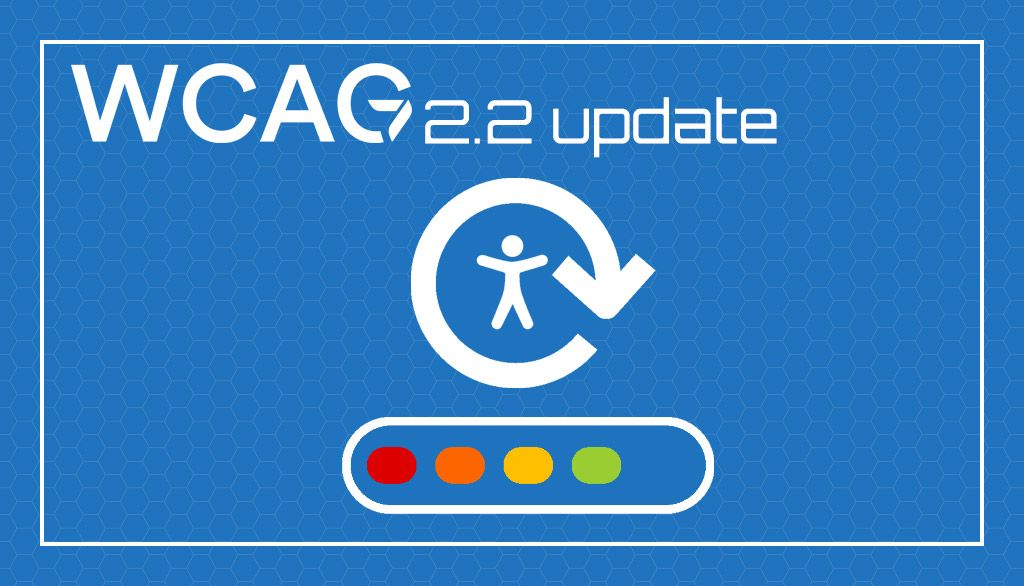
With the 2.2 update for the Web Content Accessibility Guidelines (WCAG) is time once again to improve how we approach accessible website design. It is important that web developers start taking accessibility seriously, if not for the users, then for themselves as more laws come into play that may hold them responsible for any shortcomings in the websites that they build. This short checklist is a starting point to set you on the path to building accessible websites for your clients and users.
Tools
There are a host of tools currently available to help you with your website design tasks.
Web Content Accessibility Guidelines: Everything you need to know and more.
axe Dev Tools Plugin: Browser plugin to scan your website for accessibility testing. Be aware that manual testing is still required because no scan tool can scan for all issues. But this will set you on the right path.
WebAIM Contrast Checker: This tool helps you select the proper colors needed to maintain a 4.5:1 color contrast ratio.
Page and Text Formatting
Minimum body font size should be at least 12pt. Smaller font sizes can be harder to read due to close spacing and simply being too small to read without the user resizing the website. It is preferred to start with a larger font size to be accessible to all users. We use a 16pt body font size here.
Line heights should be at least 1.3 for headings and 1.5 for body content. As above, this is to provide enough white space between letters to make them easier to ready for everyone.
Headings (h1, h2, h3, h4, etc) should be used semantically and not for design reasons. Many accessibility rules are also great for your on-site Search Engine Optimization (SEO). Heading tags should be properly nested inside of each other.
- <h1>: Title (one per page)
- <h2>: Sub Headings
- <h3> etc: Subheadings
- </h3>
- </h2>
- </h1>
This structures your content in a way that easily read by users, screen readers, and search engines.
Headings should not be used for primary navigation. Many designers choose to use heading tags as design elements rather than structural elements which often leads them to making poor structural choices in favor of design factors. Heading tags are for grouping topical content ideas, not for navigation.
Links should be clearly identified. As you can see on this page, and others on this site, in content links are all identified by both color and an underline. This makes it easier for users to find, and identify text elements that make take them away from the page that they are reading. In the past SEOs used to hide text from users by making it look like any other text on the page. They did this to allow themselves to stuff their content with internal links for search engines but keep the page from looking like a field of spam to users. This may be fine for regular users, but for someone using a screen reader it can make the content unreadable.
Underlining not-link text should be avoided. Not only is this an accessibility issue, but look at any heatmap for a page with underlined text and you will see that even when it is not a link it is clicked on quite a bit. This leads to frustration for all users.
Link leading off page should be clearly identified. When a user leaves a page through a link, their screen reader may lose their place in the content that they were reading, and it just not good manners. You can see the standard icon that is used for links off page in the tool links at the top of this article.
If you want to add this functionality to your website, you can add this simple CSS to your site's head section. It may need minor modifications based on your particular CMS, but it works great on WordPress.
<style>
a[target="_blank"]::after {
content: url(data:image/png;base64,iVBORw0KGgoAAAANSUhEUgAAAAoAAAAKCAYAAACNMs+9AAAAQElEQVR42qXKwQkAIAxDUUdxtO6/RBQkQZvSi8I/pL4BoGw/XPkh4XigPmsUgh0626AjRsgxHTkUThsG2T/sIlzdTsp52kSS1wAAAABJRU5ErkJggg==);
margin: 0px 3px 0px 5px;
}
</style>
Links should have discernable text. This is similar to alt tag issues with images. Many links are now created with icons rather than images to further reduce load times. Unfortunately, many of these icons are unreadable to screen readers and need ARIA title text added to them to indicate where those links go.
Excessive font styling (emphasis/italics) should be avoided. This can make some font choices hard to read for users with sight issues.
Lengthy strings of ALL CAPS should be avoided. Again, this can make content harder to read for some users. It makes each word have a standard rectangular shape that makes them harder to read.
Don't use condensed/narrow fonts. Font spacing is important when letters can be squeezed together in a way that makes them much harder to read.
Images and Video
Images that are not decorative MUST have alt text. Alt text has always been important for images to be understood properly by search engines. It is even more important for screen readers and other adaptive technologies.
Alt text must describe the image content. SEOs have traditionally used alt text as a keyword stuffing tool. This is far from useful for people with vision issues. The alt text can contain keyword data, but it is more important that it clearly describes the image. Look at this ring as an example.

Alt text option 1: Engagement ring.
Alt text option 2: White gold diamond ring set with a large round diamond in the center with 10 small rubies, 10 small blue zircons, and 6 small diamonds.
It should be obvious which is the better alt text for users and for search engines.
Graphs and Charts must have alt text and should have supporting text that describes the purpose of the graph/chart. Much like images, graphs and charts also need to be described for screen readers.
Images should not be text only. This is a common issue when designers want a very specific look for text but don't want to take the time to do it properly in CSS. Adding alt text is generally not enough to overcome this issue and all text only images should be rendered in actual text.
Transcripts of videos should be provided. Another example of accessibility also helping with SEO, adding a transcript to your page allows people with hearing difficulties to read the transcript of a video.
Videos should provide captioning. Fortunately, most video hosting companies, specifically Youtube, now offer automated captioning. These captions should be read and updated for accuracy whenever possible.
Avoid flashes and strobes in videos. It is well known that strobing colors and lights can trigger an epileptic event. You should avoid using them in your videos whenever possible, and at the very least provide a warning to the user before they play the video.
Videos should include ARIA (alt text) titles. Much like images, videos also need alt/ARIA text labels to describe them to users.
<video ... aria-label="Title of the Video"
Users must be able to stop any video that autostarts on page-load. Or better, just don't auto-start videos. It's rude and you might just out someone trying to watch a video at work on the sly.
Design Elements
Color contrast must be at least 4.5:1. Low contrast websites are an evil that should have never been invented. To make your content easier to read the contrast between foreground and background must be at least 4.5:1.
Important information must not be conveyed by color only. Phrases such as 'click the blue button' are not useful when the only difference between buttons is color. Another example would be charts. This chart, for example, is all too common for most people.

This chart uses shapes along with color to define the different series. This allows the information to be shown by both color and shape, and just looks better as well.

Provide consistent navigation through the entire site. It's hard to believe that we still have this issue after 30 years of web development. When creating navigation for your website it can be in nearly any form, but it should remain consistent and not randomly change locations for 'design reasons'.
Support keyboard only navigation. Many users lack the fine motor control needed to effectively use a mouse. These people need to be able to navigate your website with only a keyboard. This is an issue that almost no one tests for because they don't think about it. An example of this being an issue is when a focused element disappears when clicked. Items such an a button that when clicked goes away and turns into 'Thank You' text.
Use landmarks to define distinct sections of a webpage. Again, this should be common in website development, however, many CMS platforms leave this out. Each section should be identified with a short code element, here are a few examples.
- <header>
- <nav>
- <main>
- <aside>
- <section>
- <footer>
An example of this in html/aria format is:
<div id="leftnav" role="navigation" aria-label="primary">
<div id="footernav" role="navigation" aria-label="secondary">
As I have said before, accessibility is not an easily achievable end, it is an ongoing process and must be constantly tested and improved. Hopefully this checklist and the tools linked at the top of the page will help you become a more accessibile website developer.