Improve Your Website Accessibility Today with 5 Simple Things

Having an accessible website, one that is useful to everyone regardless of ability, is important. Not only is it a great idea to be inclusive, but it is also quickly becoming a requirement at many levels and can leave you, and your company, exposed to legal action. It’s important to understand accessibility is a process much like SEO and marketing. It is never really done, and no one can do it perfectly. But we can try.
With that in mind, we’ve put together a short list of accessibility techniques that you can implement now to get you started on your path.
Alt tag attributes.
Alt tags on images has been ‘a thing’ since the very beginning of the internet. Alt tags allow machines, screen readers and search engines to understand what the image is on your website. This is also one of the easiest things to do that so many people fail to do.
Your alt tag should describe your image so that someone using a screen reader can understand what is in the image. This does not mean packing it with keywords and irrelevant information, simply describe the image on the screen.
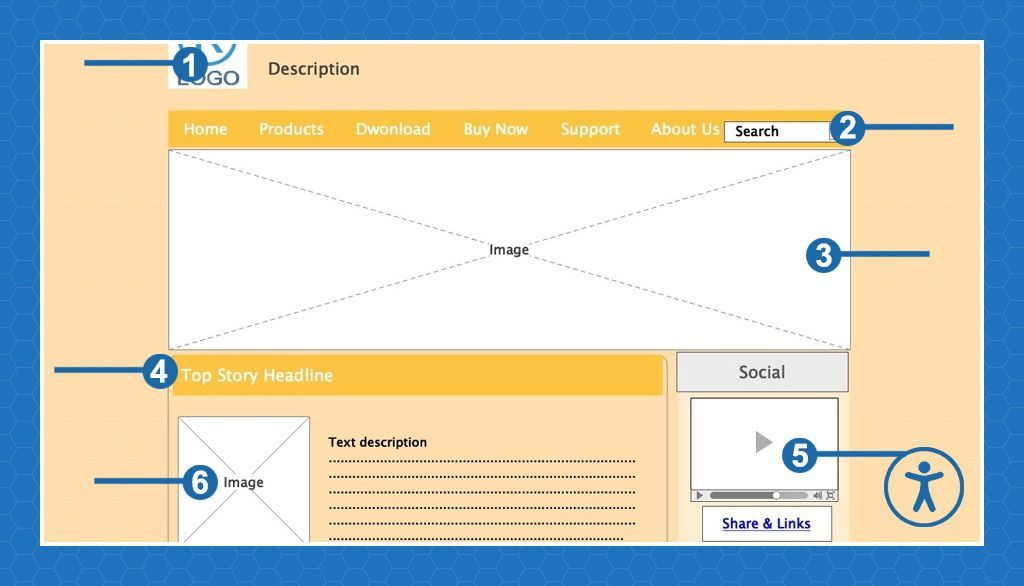
Every modern CMS makes this easy to do when you add an image. For example, in WordPress adding an image presents you with these text fields to fill out. Add your alt text, image title, caption if you use them, and a longer description of the image.
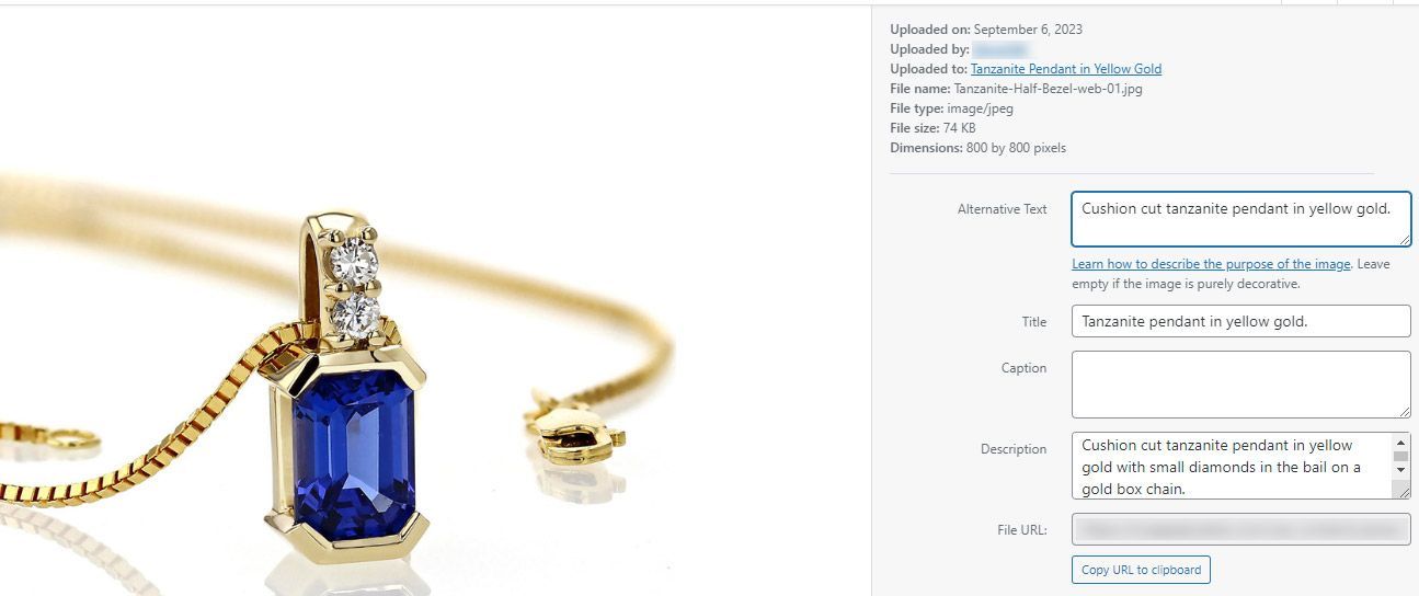
Be sure to include a period at the end of the text. This helps the screen readers understand that they have reached the end of the alt text.
SEO Bonus: This can also be helpful for your SEO, especially if you are interested in image search.
Color Contrast.
At some point some web designer decided that low contrast websites were cool. Then everyone else followed right along without ever considering just how hard these are to read for people with vision issues. Grey text on a white background is terrible for users. I have 20/20 vision and can’t read low contrast websites.
WCAG 2.1 compliance recommends a contrast of 4.5:1 to be readable by most people. Notice that I didn’t say all, but 4.5 has been determined to be the goal to be readable by the majority of users.
Fortunately, there is a tool that you can use to see if your website has enough contrast to it.
WebAIM has provided us with a color contract checking tool where you can simply enter your colors and see the ratio. Then, with a few sliders you can adjust the brightness and darkness levels until you are compliant.
Headings:
The use of H1, H2, H3 and so on, has been an ongoing argument in the design space ever since CSS became available. Many designers decided that using the heading tags was a great way to decorate text rather than using them as intended to structure content. Then SEOs learned that having an H1 on your page was a good thing, so everything became an H1. Having headings scattered around your page in some random fashion is hard for screen readers to understand and navigate. They should be used as intended, H1 -> H2 -> H3 and so on.
If you find yourself wanting to use multiple H1s on a webpage, make multiple webpages. An H1 defines the topic. If your page needs multiple H1s then you have multiple topics on one page, and they should be broken apart.
SEO Bonus: This is also good for SEO. Properly structured content is easier for search engines to understand, keeping your pages focused on a single topic keeps from confusing the algorithms about the content of your page, and you now have the opportunity to create multiple pages where you thought you wanted one large, rambling, page.
Links:
All links on your page should be easily identifiable. Somewhere along the line we designed that underlines were ugly and did away with them and just used a color to show a piece of text was a link. Usually, a low contrast color too. We won’t even go into the link sellers and PBNs (Private Blog Networks) that try to hide all their spammy links by making them look like the text on the page. You aren’t being sneaky; we know they are there and what you are trying to do.
Add the underlines back to your links, at the very least the ones in your content. Adding this bit of CSS, or a variation of it, usually solves the problem:
a {text-decoration: underline;}
While we are talking about links, #5 is another link tip.
Highlight Focus Elements:
When a user is tabbing through your website every tab stop should be highlighted in some way. In the case of a text link the text could change color or change in some way to indicate that this is where the focus element is. Again, this is something that a lot of web designers have done away with in an effort to be “pretty”.
Maybe your menus could add an underline to the link as someone tabs through, or your in-content links could have a dramatic color change. But they should change in some way. The CSS for that might look like this:
a:hover {text-decoration: underline; color: red;}
The actual element isn’t as important as is the fact that it should change in some way.
Building accessible websites is something that we should all be invested in. It does take a little more effort to make sure that your website is inclusive, but the day is coming when this could become legislated so being in front of the process now is important both from a legal standpoint, as well as being a good neighbor.
Website Accessibility Support and Audits
Web Narwhal is always available to help with your accessibility issues, on either a new site we build for you, on your existing website, or just preparing an Accessibility Policy for you. Contact us and we’ll get back to you as quickly as possible.